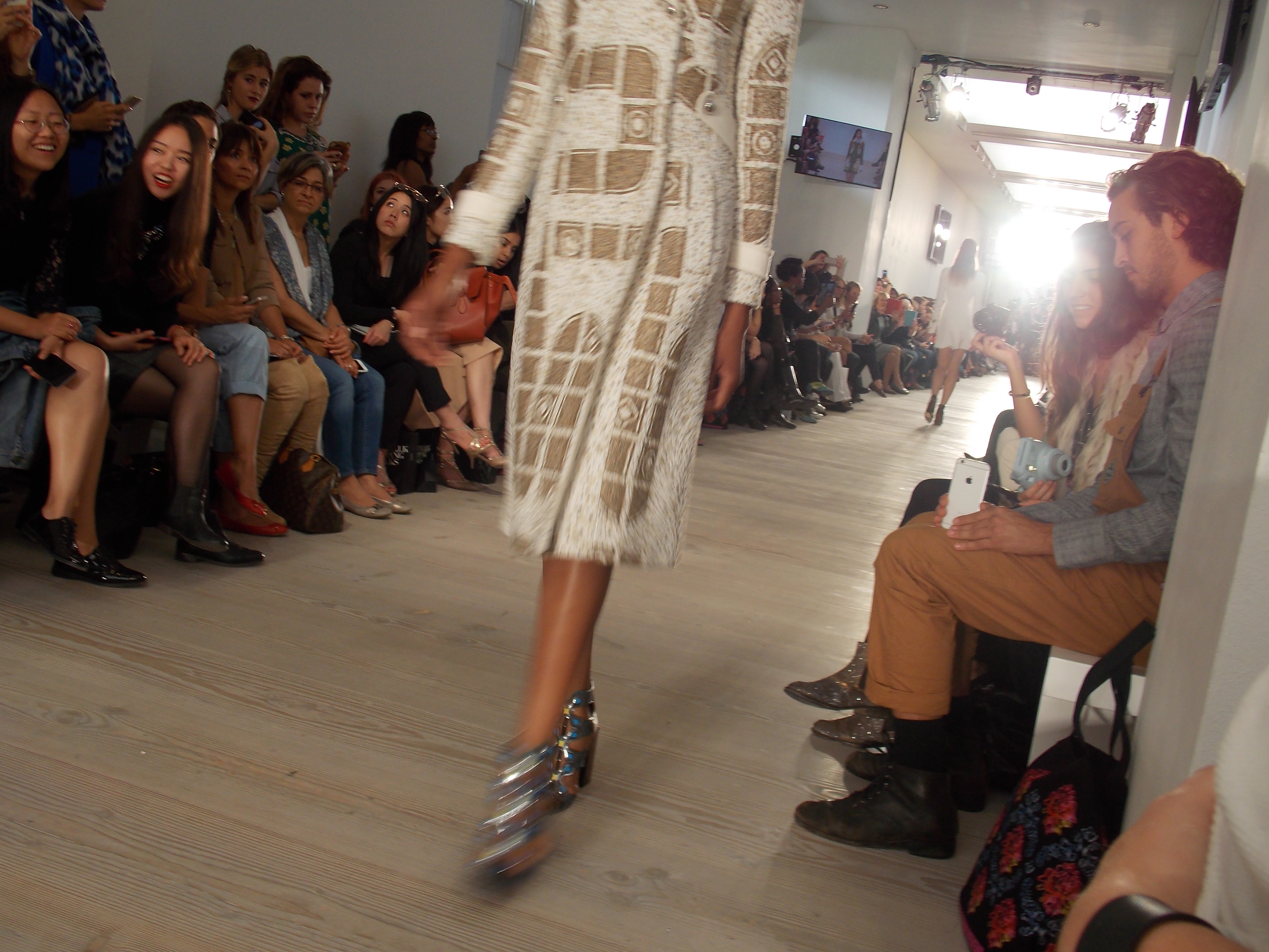
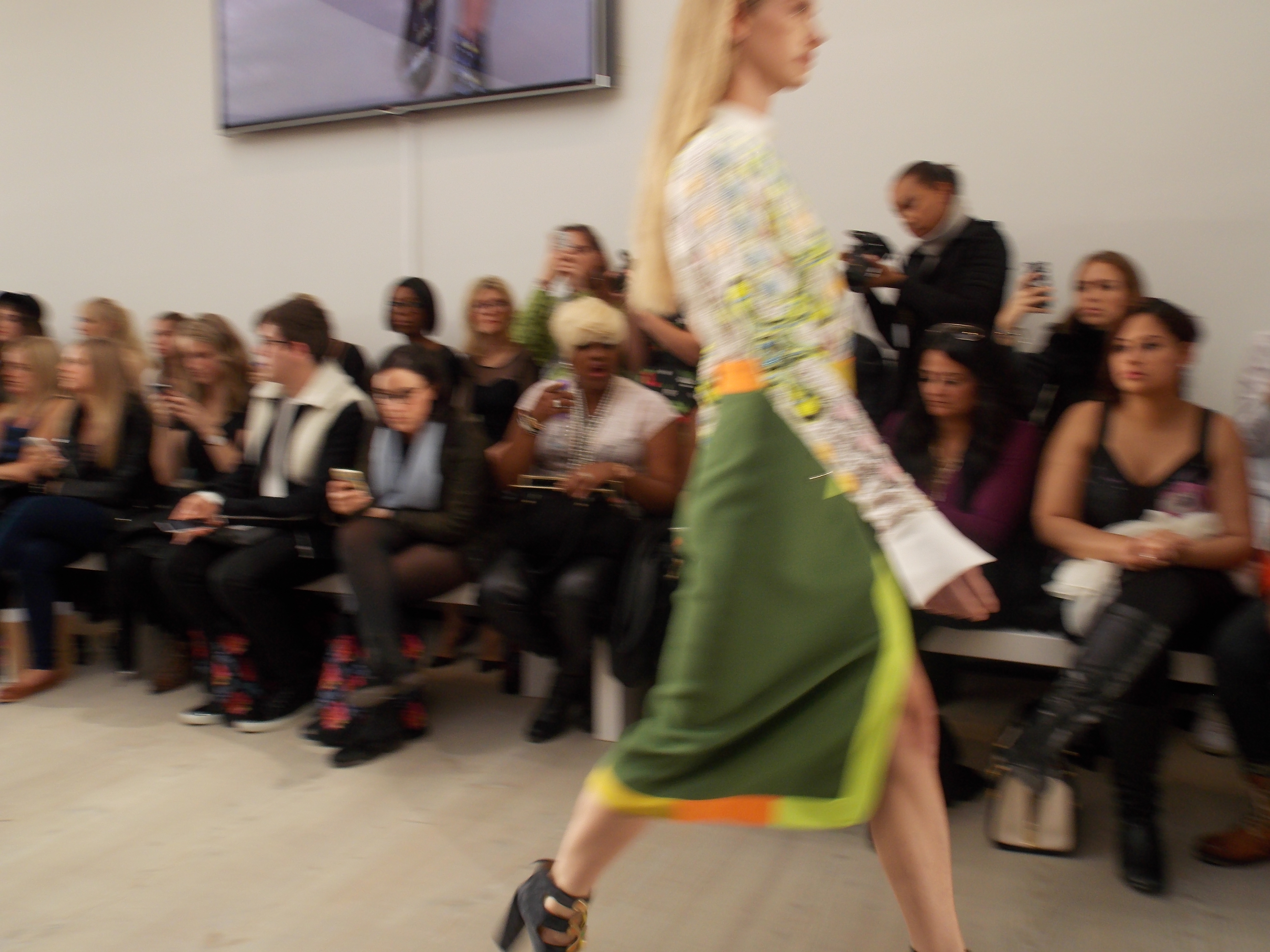
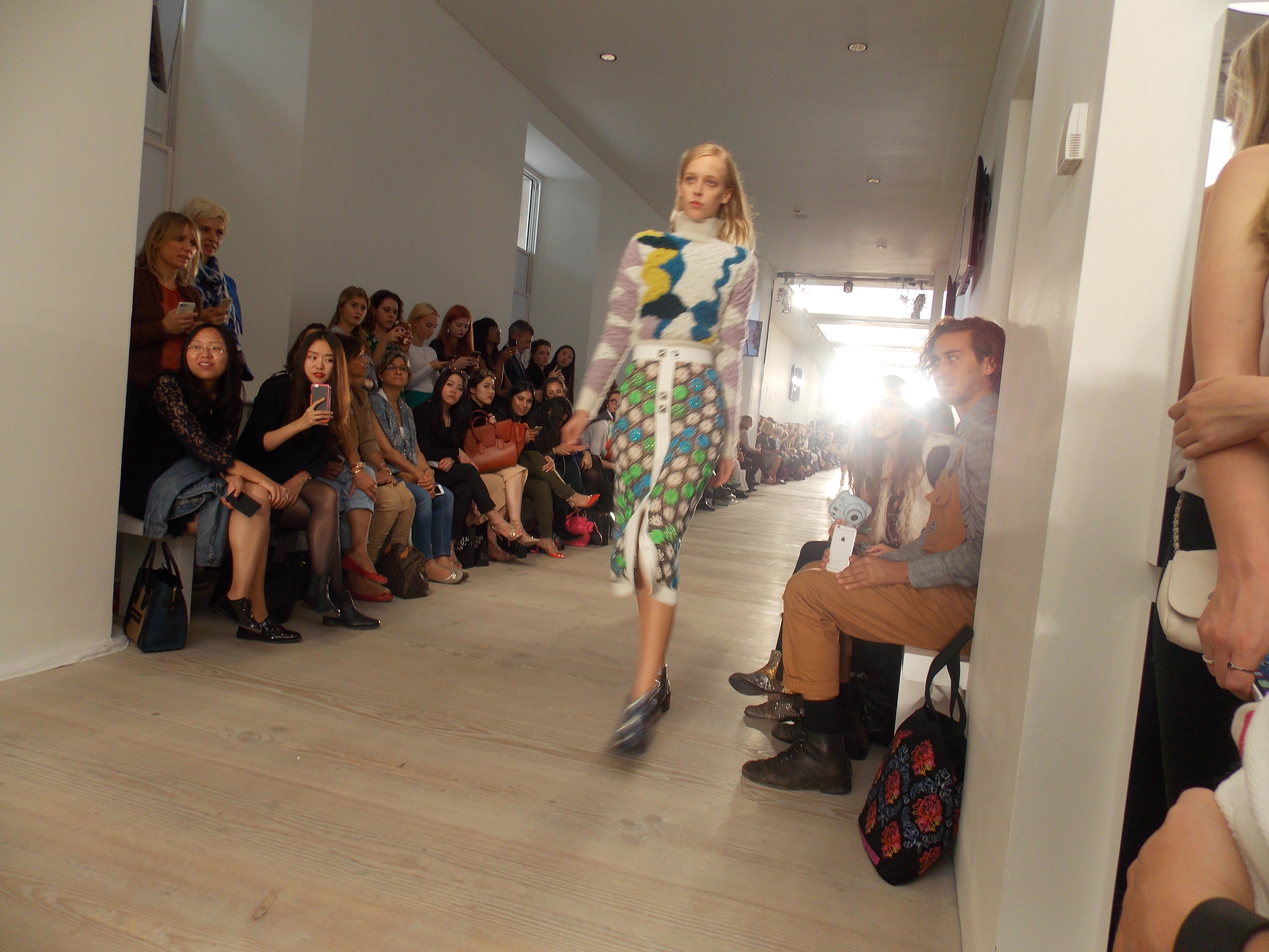
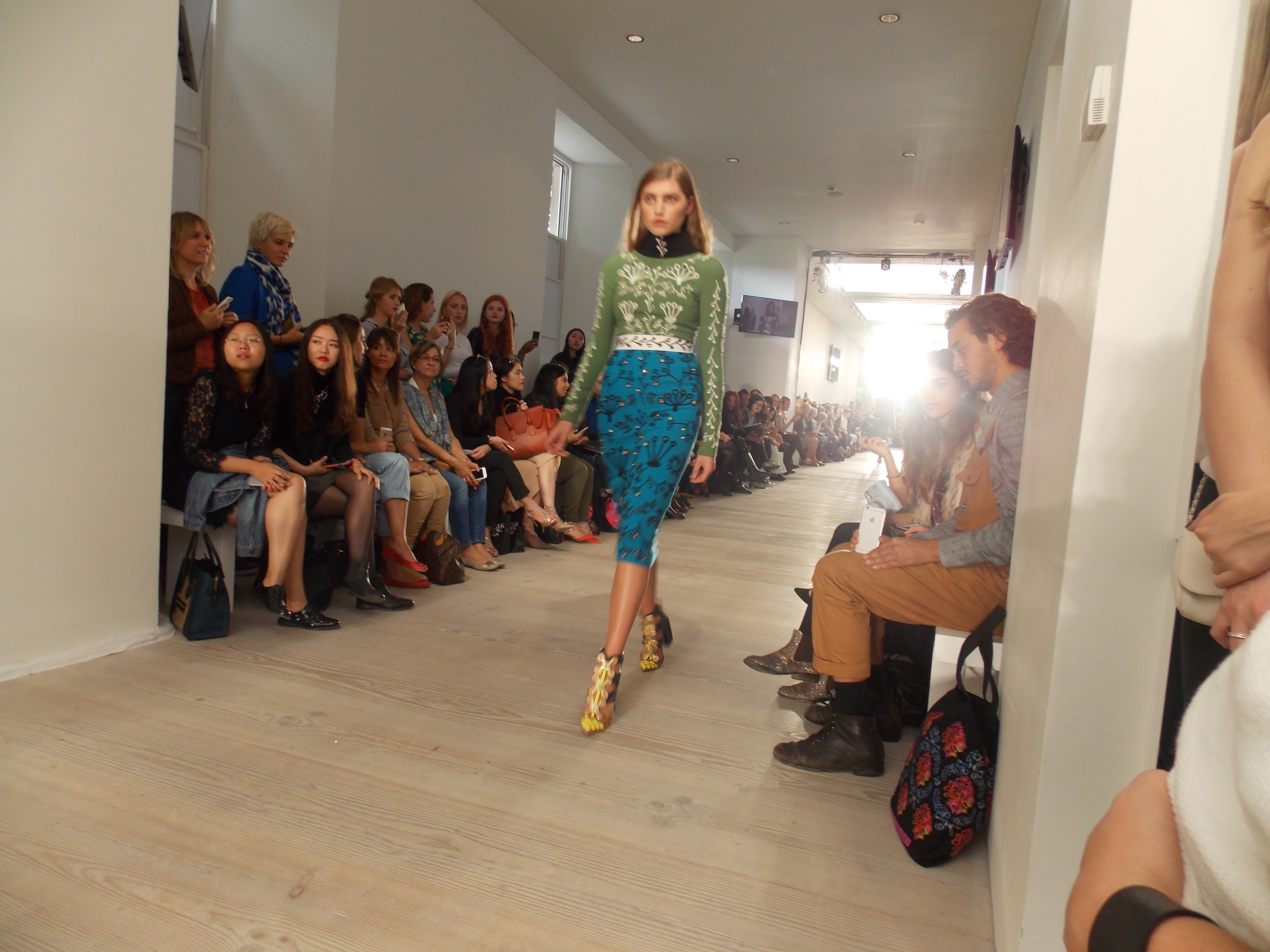
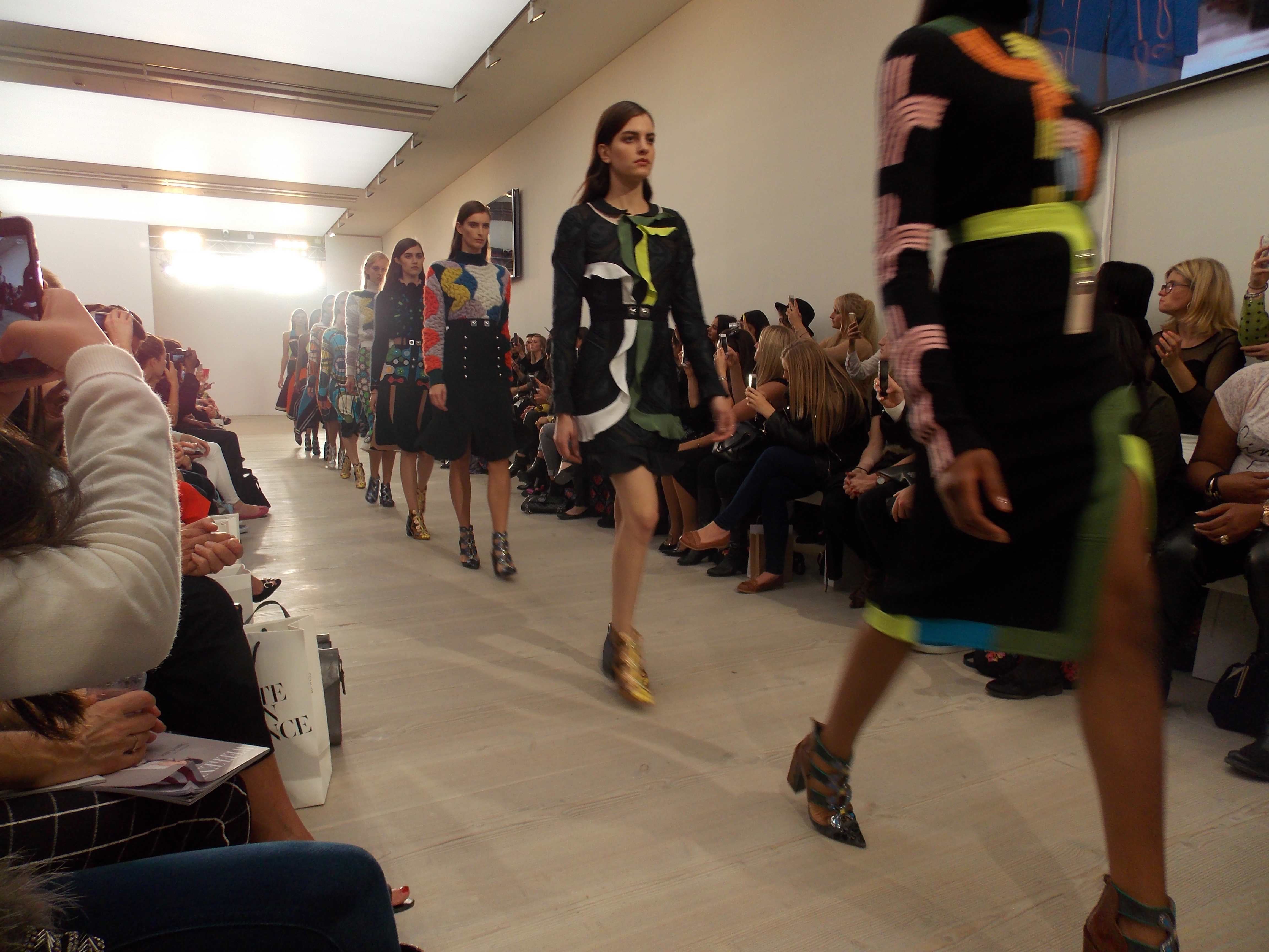
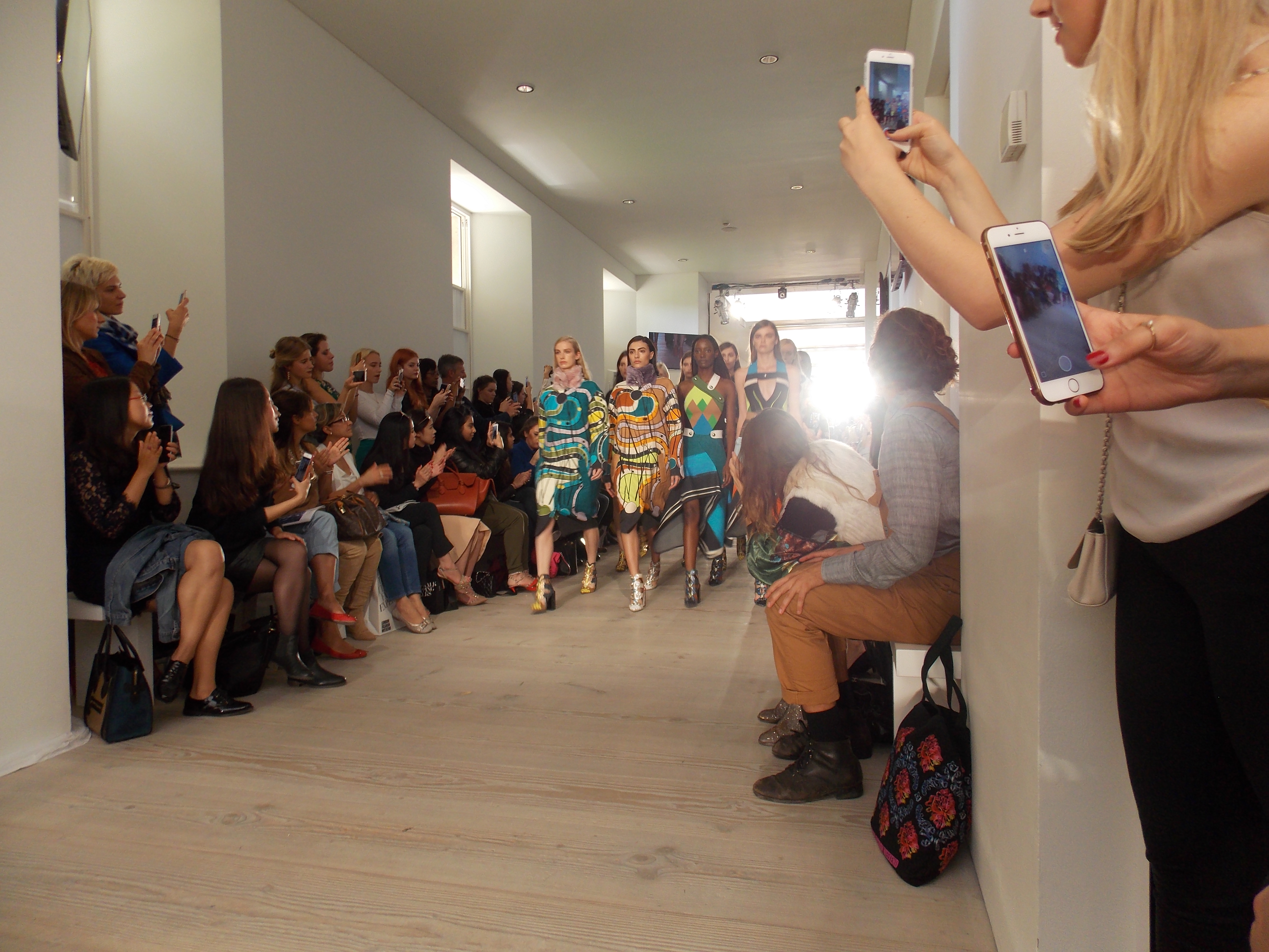
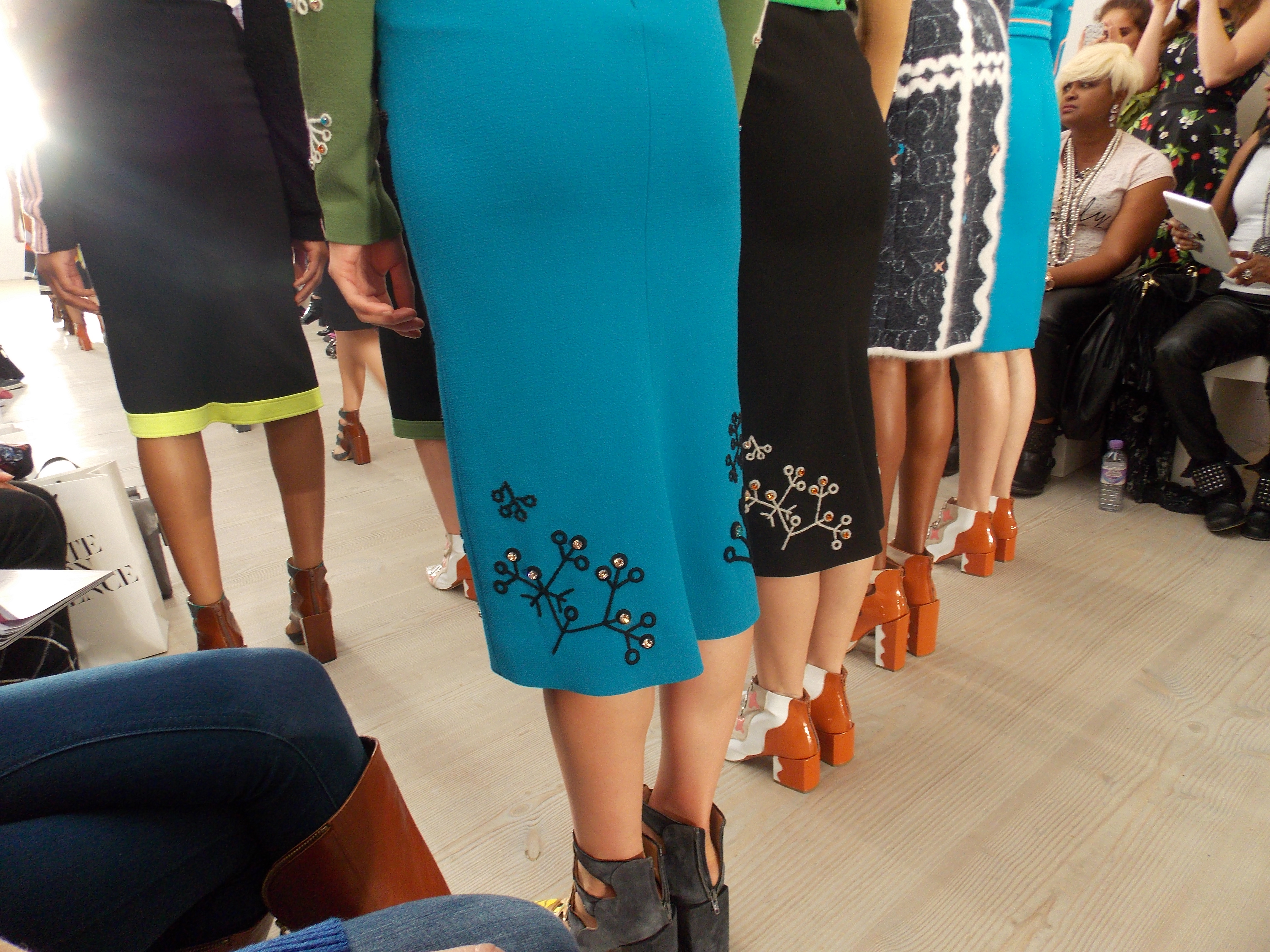
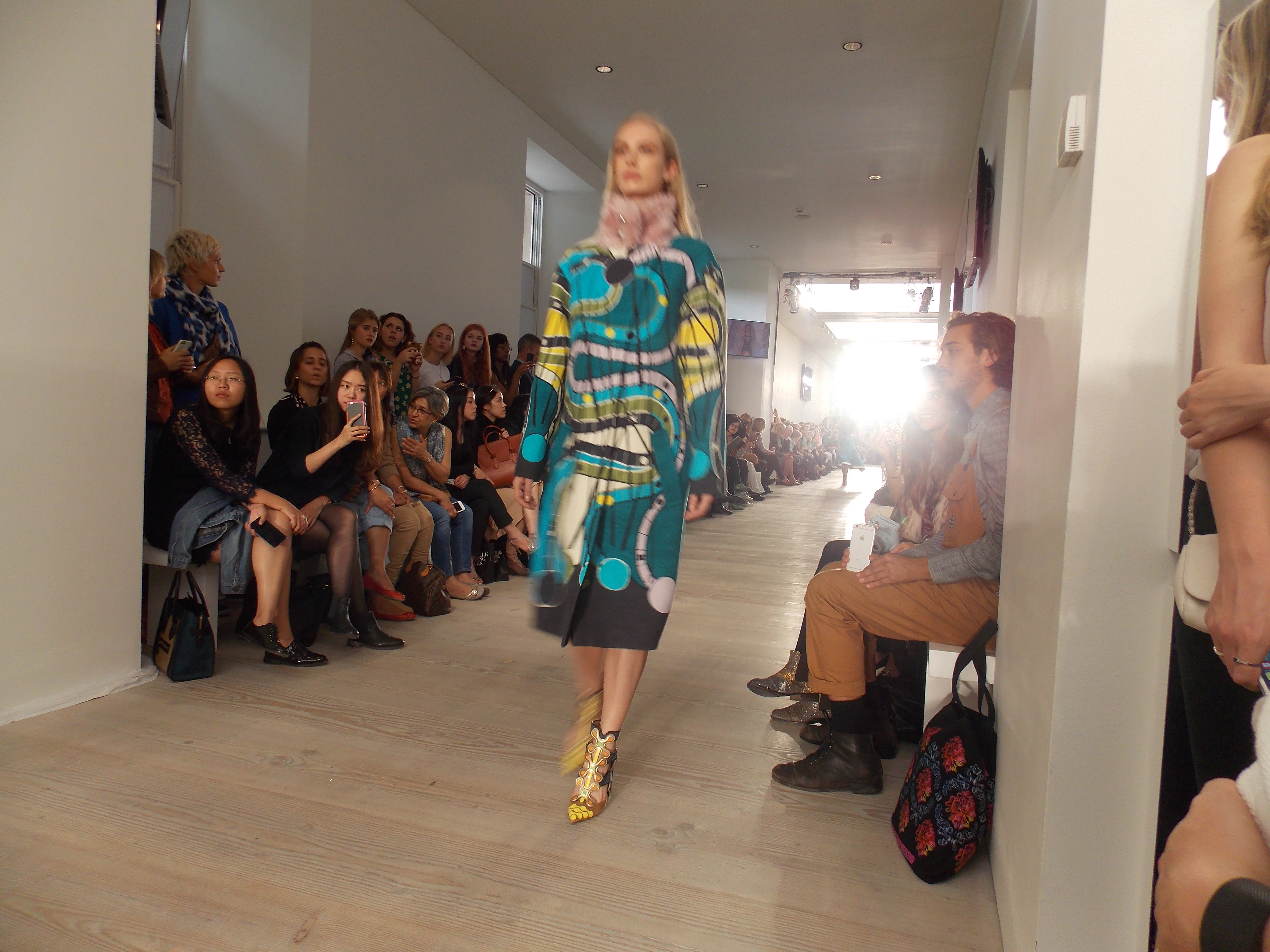
Remember those tedious yet equally intriguing board games you used to play as a child? Snakes and ladders being the one I always remember clearly playing whilst in Primary school and feeling devastated when rolling the dice and landing on a villainous snake. I knew it would always mean having to slide down however long it’s body might be; taking me right back to where I had started.
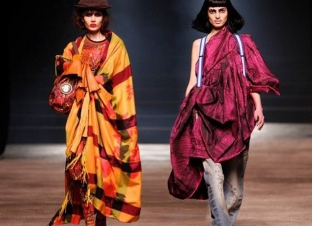
The nostalgic memory of old board games, alike with the new awakening and birth of the digital age of gaming and communication was embodied in an uncanny and futuristic collection, when sitting front row at the Peter Pilotto A/W 15 Catwalk show at London Fashion Weekend 2015.
The ambiance created by the 90’s style digital gaming soundtrack, gave each piece in the collection a feeling of movement. This feeling worked intensely alongside the shapes created on the garment print and embroidery; rounded shapes and corners suggestive of continuity but also, in contrast provoking awkward unconscious images of dead- ends and cul-de-sac claustrophobia.
Nevertheless, silhouettes, wide cuffs, rounded collars and colour palette of Pilotto’s collection, materialised visions of 60/70’s teenage rebellion and the relationship they possessed with the nature and preservation of the earth. The constant fusion of digital futurism and retro home décor depicted a collection entirely unusual, but subconsciously reminiscent. The translation of earthy tones with mixed unlikely textures such as velvet, crochet and wool bolted together with metallic button details appearing perhaps like obstacles in a game, could act as a reflection of human development in the ever-growing and consuming industrialised world.
Following Li Edelkoort’s recent interview with Dezeen magazine, I feel this influential fashion forecaster certainly has a point.
“Fashion is insular and is placing itself outside society, which is a very dangerous step.” – (Dezeen- Li Edelkoort)
Fashion nowadays, keeps itself to itself. People often fight to become a fashion student in London; London is the place to be after all.. But what is it doing to our communication and understanding of the wider world?
London is of course a place of diversity, we all know that. But I feel perhaps it is time we stretched broader, we had a revolution in where we place fashion on the map. London inspires London. Everything happens in London, students work to achieve the continuous standard set in London but why not look somewhere else?
This alarming factor I feel has contributed to the fall of fashion today.
Like Edlekoort says; ‘ “We still educate our young people to become catwalk designers; unique individuals”.
However, despite this, the fall of fashion is forever being caused by environmental factors. We cannot sustain fashion. Fashion in my opinion is becoming too fast, and what is fashionable about that?
In Edelkoort’s understanding and findings, society is now about ‘exchange and the new economy and working together in teams and groups’ and fashion seems to be following the motto ‘ignorance is bliss’.
Not forgetting western’s society’s loss in textile craft and skill; nothing is being passed down the generations any more, so how can it be sustained? Is fashion not about art and craftsmanship any more?
Fashion blogger’s nowadays, like Edlekoort explains, have no depth of understanding of fashion and culture, and have replaced it with ‘shadow coverage, like the generation’.
I cannot but feel enraged by this realisation of what the fashion world has become. Fashion is ever changing; it is beautiful and transient in that respect, however we are abusing it and becoming ignorant to it’s real meaning and historical background.
‘Fashion is governed by greed and not by vision.’- (Dezeen, Li Edlekoort)
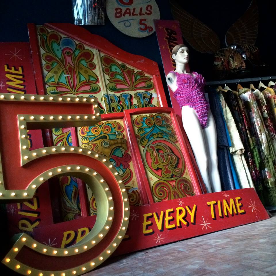
‘Is this shop for ladies?’ one of Dawn Frogson’s customers asked when entering the mysterious time capsule ‘Curio Junction’ just off the corner of Hyde Park Road. As the once brightly painted pink and turquoise ‘Mr Scarecrow’s Attic’ had all of a sudden taken on a transformation, not of darkness into light but aesthetically lightness into dark; passers-by cannot help but be curious as to take a peek at the uncanny and yet equally extravagant displays, that the windows reveal of the treasures and art installations that can be found waiting inside.
What were your inspirations for coming up with the name ‘Curio Junction’?
The shop sits on a junction, and with the use of the post code, alike with places in London, I wanted people to question ‘is it a shop or is it a place?’ I wanted it to be intriguing and unique.
Have you always wanted to do what you’re doing today? And what steps did you take to become your own business?
Yes I have, I am the fourth generation of dealer within my family. My great Grandmother sold silk stockings in the war.
I feel as for the steps in becoming my own business is a lot to do with the saying ‘curiosity killed the cat’. But the love for old things and a love for fashion and clothing plays a big part in it, as well as being a bit attention seeking!
I spend a lot of my time planning, I never stop thinking about what and where to source things etc. I like to think more about what it is to trend set rather than what’s in trend.
What does your average week look like?
I usually spend Saturday evening up until Tuesday up and down the country sourcing stock, and connections with other antique dealers. During the week I’m in the shop, as well as using social networking sites such as Instagram and Facebook posting about Curio Junction. I also appeared on Channel 5’s ‘Storage: Flog The Lot!’ and won! I also do a lot with Plymouth College of Art as I find it such an inspirational place in Plymouth and I feel Plymouth is really finding its place in the art world.
How would you describe your sense of style and how does this influence you and what you buy and sell? Who are your inspirations?
Hmm… Eclectic! Unique, thought inspiring, as well as the shop perhaps being a bit uncomfortable and questioning. I have a circus thing going on at the moment, there’s a lot of gold and I’ve just made a backwards clock!
People inspire me, I like to people watch; art is a funny thing, it’s how you class it.
I’m inspired by things such as the way many old people write; it’s like calligraphy, young people nowadays don’t write in the same way any more. There is a definite loss of skill in this sense. There were a lot of secret people back in times like after the war, who would craft things and make and paint things, without it being acknowledged as art.
What advice would you give to someone that would like start up their own business alike with your own?
Never get in debt! That way you can always do what you want. It is almost impossible in this era to do what you want. If you start small, like people starting or planning in their bedrooms or while living at home with their parents, then you can be a free spirit. Don’t start with a noose around your neck. I’m in contact with people all around the world, the New York Bronx for example. The world is open, and I’m no techno but all you need is a laptop.
Like and share the Curio Junction Facebook page at: https://www.facebook.com/pages/Curio-Junction/800809869989305?sk=photos_stream
Follow the Curio Junction on Instagram at: Curio_Junction
When walking down Rue Saint-Honoré, in Paris, you would not necessarily notice Colette by the building Its set within; unlike with many of Paris’ famous department stores. Colette instead, is rather noticeable by both the cluster of excited people hanging around outside of it as well as inside of it; and perhaps with a few high end Parisians snickering at both these excitable tourists and fashion students eager to investigate.
Before visiting Paris however, I had imagined Colette to be a much larger store than it actually turned out to be. To be honest, I did not know what to really expect as I had never been to Paris before, although from my experience of department stores in England as well as a few other countries, I was not expecting one like this.
Nonetheless, its seemingly limited space, I found added to its quirky, uniqueness and I felt keen to explore.
As soon as I walked through the doors, the smell of coconut took me to a place of sand, sea and sun. This was maximised by the calm yet eccentric and upbeat music playing, which also reminded me of summertime and youth. The whole ambiance created within the first entrance of this store brings people immediately back to their youth, and with the simplistic white walls and glass fixtures; the bright energetic colours from the knickknack products displayed are made centre of attention. Books, magazines, hats and accessories at the front of the store are conveniently displayed there so that tourists are able and can afford to purchase something to feel a part of Colette.
The store showcased select items, alike with the male clothing rails on this entrance floor which adds the feeling of desire to purchase something from this famous and one of a kind store.
One thing however, I did find slightly bizarre, was when there seemed to be quite a large queue of people, queuing down the stairs to the lower floor. Although I then found out that there was a restaurant on the lower floor, which made the place seem more like a department store, however still feeling fairly cramped and overcrowded. The queue, in my perspective, made the store feel more exclusive and desirable.
Eventually on my way upstairs, I was surprised to find that people were unable to take items around to other floors, as a friend was stopped by one of the assistants whom said he could keep it back for him until he returns to the floor. This to me, made what I thought a youthful, and energetic place slightly more sour and restrictive. I began to think to myself; Is Colette a youthful, up beat store with parental control and supervision?! If so, then it’s not working well for their customer service skills.
The music continued from this floor up to the third floor, which kept the place up beat compared to the service, I particularly admired the layout and the way in which designer collections were displayed in rows on white mannequins. I enjoyed looking closely at the amazing detailing in the clothes as well as working out the designers inspirations. We were able to take photos however, we were told (yet again by the shop assistants) not to take photos of detail and close up, which again was quite uncomfortable. But fortunately the clothing shone through, acting more like an exhibition for designers rather than a department store. From Givenchy, to Mary Katrantzou, I was fascinated by the fabric usage, silhouettes, shapes and techniques used in these garments and collections.
The one item per garment on the rails made like a flip book of clothing which made it quicker to absorb the styles and elements on more garments than looking through garments in a high street store.
Colette, in comparison to the Moschino store in Paris, produced a very different experience, as with the amazing service we had in this designer store instead. The assistants in Moschino were eager to help and provide information for us as soon as we entered the store, which was similarly set up to Colette, but with more bold and energetic colours of the Moschino collections. Admittedly, the store however to me, did not create the same ambience, as there seemed to be no music and we were almost the only customers there at that time (which may have been why we had such good service) although I did feel much more welcomed within this store.
Despite the service within Colette, by it being more of a small museum of a department store, the products were the main attraction and by having such strong, developed branding, people all around the world want to become a part of it.
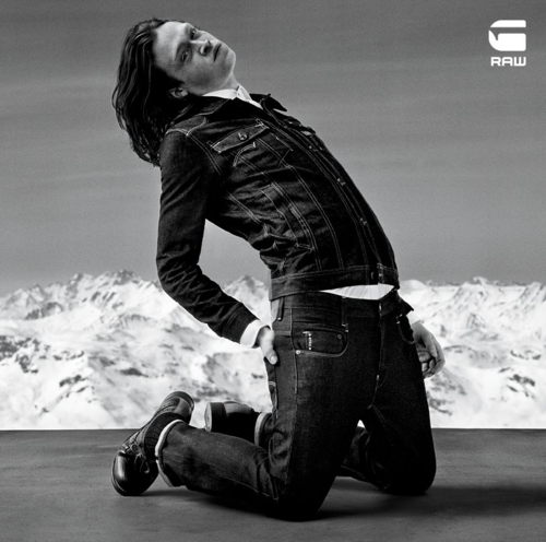
G- Star Raw is a brand that introduced the concept of ‘luxury denim for the streets which awakened the fashion world towards both the functional and symbolic nature of jeans’.
Founded in 1989 in the Netherlands, G-star was the first brand to unleash ‘raw denim’, completely untreated and straight out of the factory. It has been continuously influenced by military uniform, which had inspired the brand to create special cell phone pockets and zipped arm pockets on jackets, to not only give a feel for military chic, but also responding to modern day conventionality.
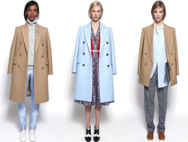
Jean trends today emit a very ambiguous style. They’re worn and distressed, but still uphold all the qualities of being brand new to the consumer. People want to buy jeans that are pre- broken into because not only are they more comfortable to wear, but they also fit the idea behind what jeans are about.
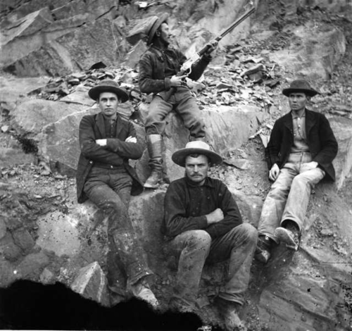
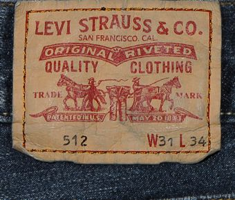
Within the 1800 jeans were used for work, and their durability for American gold miners. To meet the demand of the miners, Levi Strauss came about, supplying clothes to the people that required it. The popularity of jeans started to escalate more around the world, when Cowboys in the movies were seen often depicted to be wearing jeans, leading to a huge increase of people wanting to purchase jeans.
This concept and idea of jeans being a symbol of work and durability is almost nostalgic. Today, both men and women wear jeans as it has become an androgynous piece of clothing which can be both feminine and masculine from skinny jeans to the baggier, loose fitting boyfriend jeans; both sexes can wear either and the idea behind them stays the same.
I feel G-star raw, has a style which directly reflects its ideas and concepts as well as disclosing it’s manufacturing process. The logo design is very simplistic and the font transmits a sense of mechanical machinery. It could be argued that it is quite a stereotypical masculine font style that provokes you to read it quickly and with a deep voice. There is something very serious about the logo design, font style, as well as provoking a sense of haste and suppressed energy.
However in keeping the cultural significance of jean history, G-star raw, stimulates an image of futurism and industrialisation. In doing this, it delves into the past in connection with our future, perhaps hinting at the idea of jeans being constant and never changing. This can also be seen in the brand style of G-star raw which seems to have not ever dramatically changed.
From Miner, to Cowboy to Urban street, jeans have been adapted to suit all. G-star Raw boasts intricate cuts and style features, modernising jean culture to emulate the idea of working chic.We are invited, when purchasing a pair of G-star raw jeans, to create our own worn marks, in order to give our jeans character and a story of our active lives.
Compared to Levi’s, G- star raw is less provocative of jean history. For example, Levi logos have an image of working cowboys on horses, whereas military influences are subtly weaved through the cut, style and features within G-star. In this sense, it could be seen that G-star is a more modernised brand, that gives a masculine edge to both men and women, empowering them in an androgynous style and aspect.
Overall, I feel G-star raw, as well as many raw denim brands, invite the consumer to create their own story within their denim. Denim is a material that becomes ever the more beautiful with its wear and tear, and upholds a history that is timeless and symbolic of denim jeans. References:
Can the wild ever be tamed? Erdem’s Spring, Ready to wear 2015 collection suggests otherwise. As embroidered plants and wildlife appear to grow, sprout and stretch over the models bodies, the crochet web-like textural structure seems to act as if it were trying to tame it; like barbed wire, a botanicle enclosure. The colour scheme strongly embodies midnight and navy blue’s as well as emerald and jungle green’s. Both blue’s and green’s are the two dominant colours within Erdem’s colour palette, reflecting water and earth, darkness and light. As these colours seem to present a haunting, dark beauty of nature, the powder pinks, blushing reds, lime and sunflower yellows, pale turqoise’s depict something more energetic and youthful. The isolated texture’s on the two piece design’s reflect that of entangled exotic birds in the use of seemingly sporadic feathers, delicate flowers made by thick embroidery and velvety fabrics.
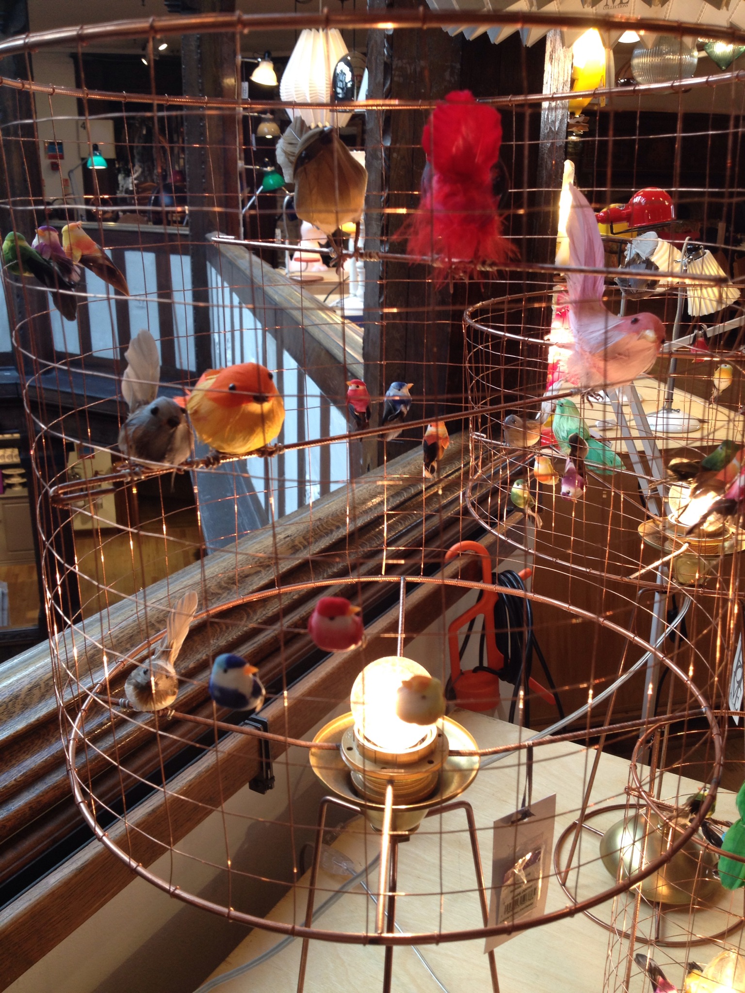
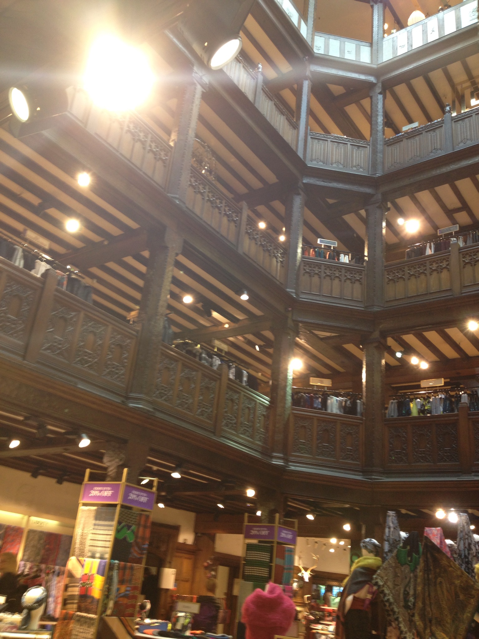
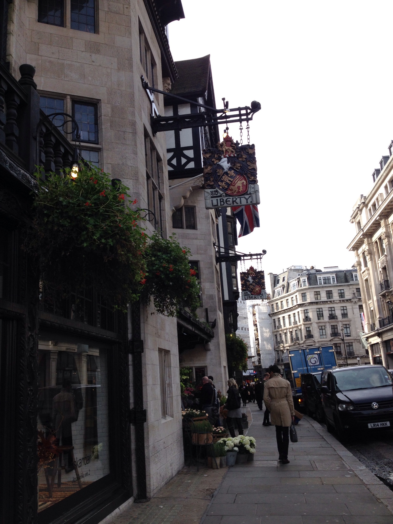
When you first set eyes upon the exterior aesthetic of Liberty, in the west-end shopping district of central London, it feels as though you have been transported back to the medieval/ Tudor era of England. The building itself, stands apart from its surrounding buildings, by its grand traditional oak wood beams against white paint and combining stone; immediately inviting customers to further inspect the interior grandiose of this unique and exclusive department store.
The window displays echo the season, and emit an idealized image of what you should be wearing in the current season. For example, when I went to visit, there was an autumnal window display, with traditional colours of copper, orange, mauve, brown, dark green and mustard, with a decorative vase of crisp burnt orange leaves with traditionally woven rugs in the same colours as well as small wooden stools. With this window display, you could tell what the designer’s influences and inspirations for the garments displayed, and how they could fit into your own lifestyle in addition to where you could possibly wear them. I also discovered that the garments in the display were also not on mannequins and rather hung up on the wall using hangers. This to me, presents the clothes in a linear style, not using a certain body shape to promote the garments in order to discriminate and narrow their range of customers, and reflecting how clothes would hang effortlessly in your own wardrobe as well as on a rail backstage in a catwalk show.
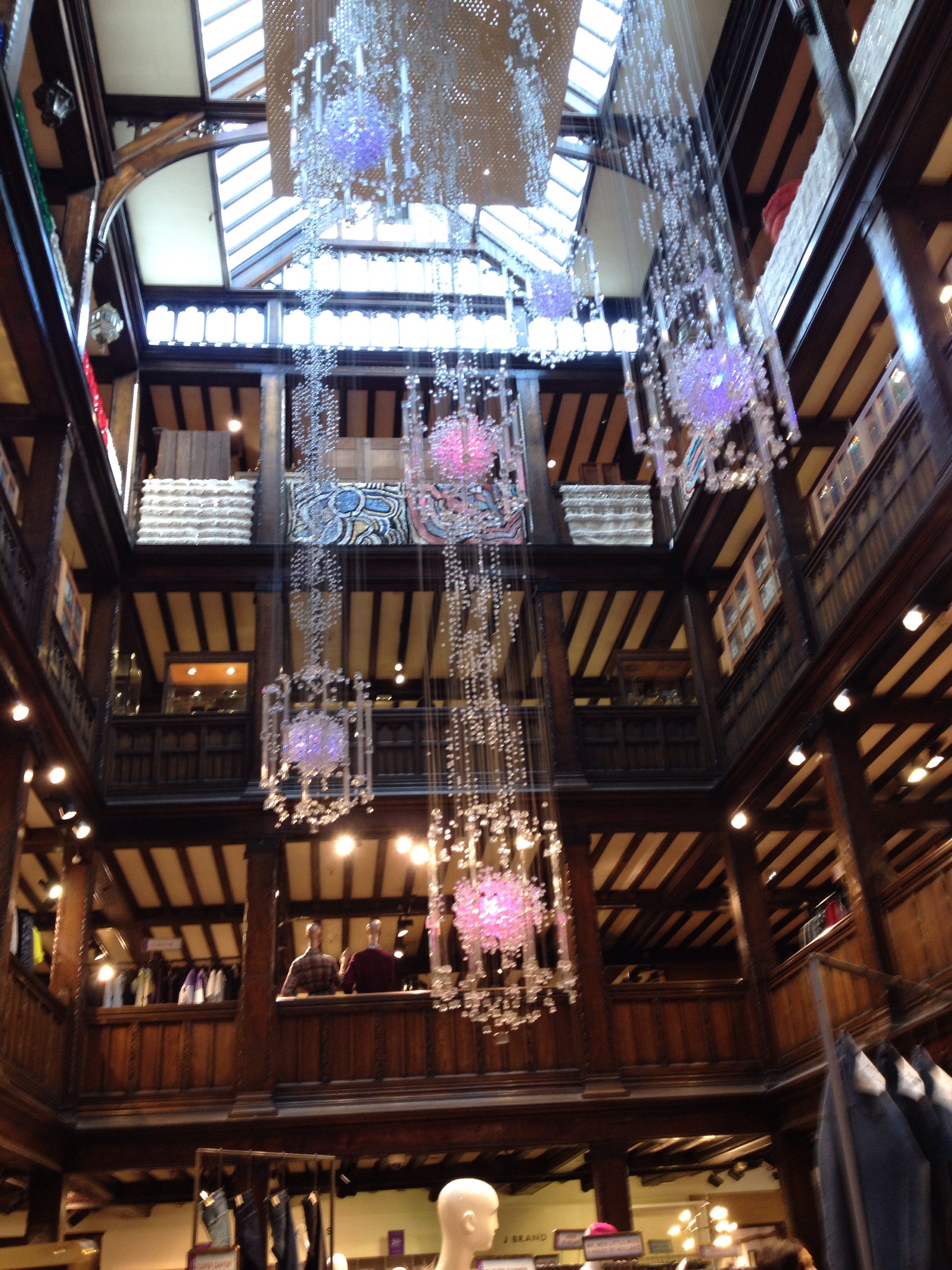
When coming to the entrance, you are immediately greeted by the strong floral fragrance and natural colour palette of fresh flowers. The outdoor elements continue further inside, with the natural lighting streaming down the center of the building from the roof; forming natural shadow and luminosity; acting to enhance selected central elements on the ground floor. There is a natural theme and flow throughout the store; combining nature with modern materialistic detail. The circular floor plan creates flow and movement, reflecting a Shakespearean theatre which allows you to see up through to other floors; unlike most department stores that would often use this space for escalators, which in Liberty’s case would detract from its traditional, historical and theatrical features. Each individual room has a particular prime product, for example, a room for shoes, a room for material, a room for women’s accessories etc. However, unlike regular department stores, Liberty emits a nostalgic ambience, as it mirrors a homely environment, creating a calm and clear merchandising atmosphere. The alternative style music plays at a low volume, and it could be perceived that they are of local British bands; fairly infamous and low key, that would not necessarily be recognized by a lot of customers. The music played is more focused on instrument rather than words and voice, its style is quirky and original, and the store continuously combines old and new with a mysterious storytelling twist.
When browsing through the women’s clothing department, I found there was very minimal signage, and all emphasis was focused primarily on the garment rather than the name of the designer or brand. Clothing pieces were displayed on hangers on similar metal rails, each having one small typed writing piece stating the designer or brand, as if it were a signature at the bottom of a piece of artwork. Minimal stock and sizes were on display, to decrease untidiness and focalize more individual style pieces, also meaning you would have to ask for the sizes. To me, Liberty works to expose fashion in a more artistic way; garments are displayed as pieces of art, revealing its true craftsmanship and design theory. The shop boasts that beautiful garments, do not need anything to extreme to enhance them, simplistic displays accentuate fabrics, detailing and shape.
All garments and products are finished to a high quality standard, with material linings such as cotton and silk to create thick, luxurious and shapely garments and fabrics. Seams and darts are stitched using industrial sewing machines using thick, long lasting thread giving the garment strength and unlikely to tear or create holes. Inner labeling is thick and embellished giving it the final stamp of high quality. Liberty’s brands include top designers; Vivienne Westwood, Alexander Wang, Missoni, Valentino and Alexander McQueen which all use sumptuous fabrics and materials such as Virgin wool, silk, leather, satin, cotton and cashmere; natural fibers which not only feel good against the skin but also linings beneath materials such as wool help to diminish skin irritation.
The main target customers for Liberty, would be wealthy, high fashion enthusiasts, and those who have artistic and creative lifestyles and backgrounds. However, Liberty indeed attracts a diverse range of customers, from the tourists keen to buy small souvenirs from one of London’s most ostentatious stores to browsers there merely to look and observe the latest original fashions and take in liberty’s luxury and historical experience, to the prime customers intending to purchase and promote these exclusive garments on the streets as well as furniture in the home. Overall, I feel Liberty is both a museum and an art gallery, as well as a luxury department store.
After watching Dries Van Noten 2015 Ready to wear runway show and interview on Style.com (<a href="http://www.style.com/trends/fashion/2014/tim-blanks-runway-reels-video-dries-van-noten-spring-2015) it became clear to me that we are indeed in need of some ‘peace and love’ in this modern, overpowering day in age. The organic colour scheme used in Noten’s designs emulate and reflect that of nature and this is enhanced by the slouchy way in which garments hang on the models bodies acting to deflect the harsh, conflict ridden, industrial reality of the world today.
Noten actively empowers old techniques from the past in his dual patterned interwoven fabrics, where two individual patterns and embellishments become one; crossing equally into unison.
However, opposing to the idea that these fabrics are equal, there comes also the concept that they are perhaps conflicting although equally seized as both oppositions hold the same force; neither one strong enough to overcome the other. I can’t help but think that these designs are emblematic of the decaying past, and provocative of the destructive future. For example in the photograph below, the only real traditional style design is the bandeaux chest piece, whereas the cobalt blue, sharpness of the feathers skirt reflects that of pollution and the balding, empty patches, that of the decay of nature and natural being. The Blue represents to me of oil spill and metallics as opposed to something natural.
Trends are often a subtle but obvious statements within the way people choose to wear their clothes and style themselves. They can all so often be influenced by artistic movements, popular culture, where a person lives, how they live and of course fashion. Trends can vary from place to place and are usually adopted and imitated by those around that start off by noticing and admiring a certain individual aesthetic of a person, then wanting to create it for themselves; a trend can therefore, be related to a current mood or idea of the time and can often indicate the current human condition. Wearing things in certain ways can provoke an idea or characterise a person; being part of a group in following the latest trend can make people feel as though they fit in and belong. They can have a short life-span or a long life-span that may slightly alter and changes with time. Trends are important in the fashion world because they are a key indication of what consumers want, as well as a strong prediction of what may be the next trend in order to create collections ahead of season. Noticing and using your knowledge of trends can enhance the way you think of fashion, to something more psychological and personal to each individual.
Current fashion trends of autumn/ winter 2014 include:
Power dressing; Women wearing oversized blazers that are often plain and shapeless, reflecting the 1980’s shoulder padded blazers. This trend could be a statement of the feminist movement of this time; from the strong influence of Emma Watson’s speech at the UN and the Feminist Majority Foundation which are fighting for equality of the sexes, as even in this day and age, both men and women are being oppressed by the expectations and stereotype of the sexes.
Polonecks; both men and women are wearing polonecks this season, a classic trend that has been brought back this year. The poloneck visually elongates the neck, as well as providing ultimate coverage of the upper body putting emphasis on a person’s face. This could be an important factor and current statement, to suggest identity through an individual’s face rather than body. It is also an example of clothing becoming more unisex and the clothing stereotype of the sexes is diminishing and becoming ever the more intertwined.
Vintage and upcycling; this trend has been long lasting, and it seems that wearing old high fashion items from charity shops/ hand-me-downs from relatives can emulate a nostalgic feeling as well as wearing items that no other person would be able to get hold of on the high street etc. It is a trend that is fast becoming a major influence on high fashion brands, as many are now working to create sustainable fashion by reusing material from garments as well as upcycling them.
Katie Jones is a sustainable knitwear designer who studied both her BA and MA in knitwear design at Central Saint Martins in London. Once finishing her MA, she continued to work with designer Mark Fast (who came out around the same time as designer Mary Kantrantzou) as to which Jones had previously gained connections with and worked alongside during her BA. Working with Fast, as Katie Jones explained, has generated a valuable connection as well as being one of the greatest influences and experiences throughout her career.
Initially, Jones did not think she would go on to create her own brand of knitwear range. However, whilst working as a production knitter, she discovered and established her own individual identity in the fast –paced industry. From crochet, to hand embroidery, industrial machining and domestic machining techniques, Jones has accomplished a broad range of skills that continuously support her work, which is all too often a labour of love through long hours, to get pieces completed within certain time restrictions.
Unlike fashion using secondary fabrics, Jones’ main focus is textiles and creating the material while simultaneously designing it to fit the body; demonstrative that it takes a much longer time to complete. She often works directly on the mannequin in order to create shape and pattern, rather than working on a flat design as it easier and a more realistic way to visualize and manipulate textiles to suit the body.
Many of Jones’ starting points for her collections originate from a wide range of sources that are not always fashion related. For example, Jones has used references from Native American fables sourcing inspiration from the characters in these stories, as well as from interior and historical costume and in her MA project; a Frida Kahlo Black and white book. She also revealed that she was given a broad itinerary of films to watch while studying at Central Saint Martins, to increasingly broaden her knowledge of the wider world, and develop an understanding of the connections between artists and designers filmic influences.
In my opinion, Katie Jones; designs and influences are inspirational; up-cycling is quickly becoming a major factor within the fashion industry, as sustainability is becoming a prime element. Jones’ designs are a twist of eras, the 70’s in particular, and the colours she explores and interweaves throughout her designs are edgy, bright and visually stimulating. Ultimately, her collections are incredibly diverse and enriching.
Top tips from Katie Jones:
-Don’t have unnecessary research in order to bulk out portfolios.
-Photo document if your drawing and sketching skills are not so good.
-Make sure specific important photos are annotated.
-Your work must tell the story of your thought process visually.
-Use simple templates of the body to draw designs onto, so that you can get an idea of proportions as proportions are FUNDAMENTAL to design realisation.


 Can the wild ever be tamed? Erdem’s Spring, Ready to wear 2015 collection suggests otherwise. As embroidered plants and wildlife appear to grow, sprout and stretch over the models bodies, the crochet web-like textural structure seems to act as if it were trying to tame it; like barbed wire, a botanicle enclosure. The colour scheme strongly embodies midnight and navy blue’s as well as emerald and jungle green’s. Both blue’s and green’s are the two dominant colours within Erdem’s colour palette, reflecting water and earth, darkness and light. As these colours seem to present a haunting, dark beauty of nature, the powder pinks, blushing reds, lime and sunflower yellows, pale turqoise’s depict something more energetic and youthful. The isolated texture’s on the two piece design’s reflect that of entangled exotic birds in the use of seemingly sporadic feathers, delicate flowers made by thick embroidery and velvety fabrics.